1. Landscape - The design elements
Project 1: The horizon line
I remember this exercise from TAOP, nevertheless I'll add a few photos to prove the point of the importance of how the image is composed. At this stage of my development, I'd like to think that effective composition comes naturally to me. It's like driving a car - I shouldn't need to think about how to change the gears.
Theoretically a composition should apply to the rule of thirds. I have chosen a very simple view below, where the horizon is easily seen.
Another thing I notice is that the horizon bends slightly, and I think this is because I have used a wide angle focal length. I need to investigate this further.
Theoretically a composition should apply to the rule of thirds. I have chosen a very simple view below, where the horizon is easily seen.
Another thing I notice is that the horizon bends slightly, and I think this is because I have used a wide angle focal length. I need to investigate this further.

I quite like this image, even though the horizon line is not shown.


This image is probably deemed to be the best, because it applies to the rule of thirds, and the more interesting sky takes up the main part of the frame.

The horizon in the middle creates a less dynamic image.


The grass does not add much interest to the image.
Project 2: Horizontal vs vertical
Even though our eyes most often frame our view into a horizontal image, turning the frame vertically can give the image a completely different look. The two images below work quite well both horizontally and vertically. The shadows are emphasized in the vertical version and I find that quite interesting. I generally do mix different framing in my photography, and there will be more examples of this throughout the logg book.
 Klintehamn, Gotland. |
 |
Project 3: Panorama
Since our eyes are positioned horizontally beside each other, we probably naturally view what's in front of us in a panoramic format. The normal camera frame is in a way an artifical way of looking at the view. When we create an image in the panorama format we omit what mightn't actually be so interesting, like the top of the sky or bottom of the foreground.
The images below are my first try with this panorama format. They were cropped in postprocessing to make the proportions somewhere between 2:1 and 3:1. They are quite long so I think they are closer to 3:1. I have kept the horizon in the middle on purpose. I think that good old rule of thirds might not be so efficient here. The panorama works really well in the images below, and I would love to see them in a bigger format than possible on my computer screen.
The images below are my first try with this panorama format. They were cropped in postprocessing to make the proportions somewhere between 2:1 and 3:1. They are quite long so I think they are closer to 3:1. I have kept the horizon in the middle on purpose. I think that good old rule of thirds might not be so efficient here. The panorama works really well in the images below, and I would love to see them in a bigger format than possible on my computer screen.

The main focal point is probably the boats to the left, where as the people add some interest. Loughshinny.

A minimalistic composition, with graphic shapes. The boat add a little extra.

Evening sun shining on the pier in Loughshinny and the white building.
Project 4: Collage
I haven't tried to stitch images together as a panorama before, so this was a something new and exciting to me. First of all I need to find out how to best shoot for the panorama. The following tips were taken from the video below.
- Use a tripod, level the camera
- Decide on the start and end point
- Use manual exposure, use an average reading throughout the scene
- Use manual focus, focus on a midpoint
- Avoid using wide angle focal length, such as 18 mm, as this can cause distortion. (I used 55mm in the images below)
- Take the images, make sure to overlap
- Another technique is to take vertical shots as they would cover more, the problem is then that the camera doesn't rotate around its own axis.
After the shot I needed to find out how to stitch the images together in Photoshop. I found this tutorial on how to stitch a panorama in Photoshop.The basics are:
I first tried to do this with files based on Raw files, but my pc melted doing this. So I used the basic jpg files. I used 17 images in all. It still created very big files, and my pc threatened to melt again. I merged the layers and flattend the file. Saved as baseline jpg, quality 10. I put three horizontal rows together first, and then combined the three rows.
It was certainly very interesting do this, as it was a bit of an experiment. I thought it would be difficult to combine the light sky and dark ground in one image, but the light levels actually don't look too bad. I adjusted the grey points slightly in a levels adjustment layer.
The result can be seen below. It doesn't look great, but I left the jagged edges, to show how it had come together. I missed taking the bottom right image, which clearly can be seen. Also the buildings look a little bit slanted to the right. I think if I take greater care next time to place the camera level, it would look better. Overall I quite liked doing this, but you definately need patience to do it.
- Select all the photos you want to use
- Go to File new> Photomerge Panorama> use files> add open files
- Choose layout auto
- When it has been created you can rotate to straighten horizon and crop as necessary.
I first tried to do this with files based on Raw files, but my pc melted doing this. So I used the basic jpg files. I used 17 images in all. It still created very big files, and my pc threatened to melt again. I merged the layers and flattend the file. Saved as baseline jpg, quality 10. I put three horizontal rows together first, and then combined the three rows.
It was certainly very interesting do this, as it was a bit of an experiment. I thought it would be difficult to combine the light sky and dark ground in one image, but the light levels actually don't look too bad. I adjusted the grey points slightly in a levels adjustment layer.
The result can be seen below. It doesn't look great, but I left the jagged edges, to show how it had come together. I missed taking the bottom right image, which clearly can be seen. Also the buildings look a little bit slanted to the right. I think if I take greater care next time to place the camera level, it would look better. Overall I quite liked doing this, but you definately need patience to do it.

Skerries harbour
So my first attempt looks quite clonky and wonky. I made a second attempt below, which turned out much better. After stichting and cropping, I also made a second layer with levels slightly changed, and blended the two layers to create a better exposure over the whole image. I see now that I could have lightened the foreground further. The composition might not be the most exciting, but I think this process is interesting and will try more of it.

Fylleån


Project 5: Interacting subjects and Project 6: Framing the view differently
In the images below I have used the Martello tower in Loughshinny as the subject to frame differently. Through different compositions I have proved that the view has to created and that we have to look for all different possibilities to create an interesting or different view. I have used different distances and angles, vertical and horizontal framing, and positive use of foreground.


Project 7: Figures in the landscape
The figures in the images below are small, so that the landscape is still the dominant subject. The figures helps to create a benchmark in the landscape so that the viewer can more easily compare the scale of the view. In the sea images it's easier to guage the scale, but the sand dune image gives no other visual clues as to what the scale is. It's also important that the figure has enough contrast to be seen clearly.


Project 8: Using perspective to help composition

Portrane and the Dublin mountains
The image above contains different uses of methods to increase the impression of depth. Looking at this image we feel that the mountains are far away, even though it’s in fact a flat image.
The use of scale increases the perspective as the crop in the foreground fills up the majority of the frame. The focus also lies on the foreground, even though I think it could be even sharper had a smaller aperture been used.
The haze covering the mountains lightens their tone and reduces their contrast. The warm and more intense colour of the crop appear in the foreground which brings the foreground closer. The cool colour of blue in the mountains and sky increases the sense of depth.
Other important important ways to enhance the depth is linear perspective, converging/diagonal lines, diminishing perspective (e.g. trees appearing successively smaller).
I read this article in Luminous Landscapes about the perspective that different focal lengths can achieve. The summary is that using a telephoto lens makes the distance look more compressed (i.e. distance between trees look shorter), compared to a wide angle lens. So changing the lens, and thereby distance to the same view, can change the appearance. A telephoto lens would make the scene more abstract and emphasise the graphic nature of the elements in the composition.
Project 9: Colour themes
To remind myself of what contrasting colours are, I include this colour wheel. Contrasting colour are positioned opposite eachother on the wheel: yellow/purple, red/green, blue/orange.
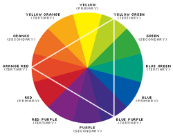
The colour wheel

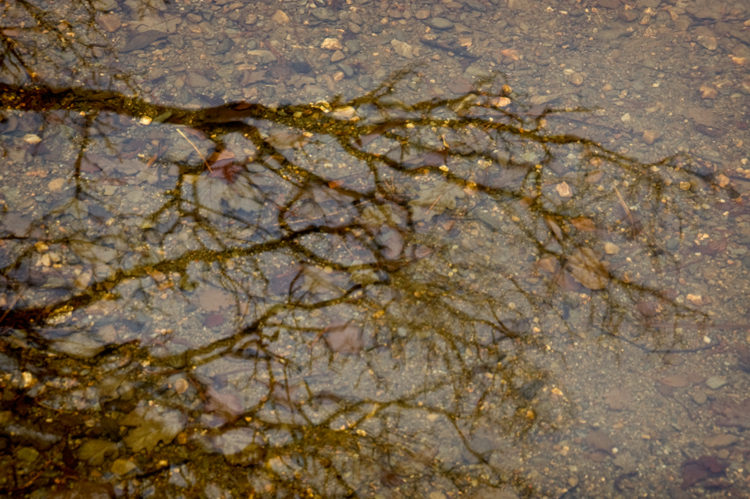
Fylleån
The largest range of greens I could find in one view. There seems to be something peculiar with shooting green colours. I was reminded of Bryan Peterson's book "Understanding exposure" which I read while I was doing TAOP. (I must re-read it as I might pick up more from it now with more experience.) He suggests that greens need to be overexposed to come out best. My image to the left contain a flat tonal range, so there was no difficulty with blown highlights, and I could easily adjust the exposure to enhance the greens in the best way.

Blue/orange are contrasting colours, but are not easily found naturally in landscapes. I had ideas like a sunflower field against a blue sky or an orange sun setting in the blue sea. But I haven't been able to come across these views. I am not satisfied that the image to the left is actually a landscape image, but it's what I have managed so far. Images with yellow/purple, red/green or blue/orange are more easy to find in the hight of the summer when lots of flowers are found.
Project 10: Soft colours

Puerto de Mogan

Maspalomas

Maspalomas
Assignment 1: The season
All information regarding this assignment can be found in the file below.
| Assignment 1 to tutor |


Tutor's comments
My tutor quickly returned the comments on my assignment. It was both encouraging and containing suggestions for improvement. It was also said that I had started with “a very individual response to the task”. Obviously “some of the results are more successful than others”. Looking at the images below now, I can see what she means.
The less successful images were:
The less successful images were:

|
2 – Happiness (the pattern and purpose fall between the gaps)
|
|
6 – One (lacks tonal range and colour detail, and pattern is not strong enough)
|

|
8 – Touch (something holds it back, another composition might have been more successful. If I get back to same location I can try to reshoot this image.)
|

|
9 – Forever (lacks tonal range)
|
I was reminded that the purpose of the learning log is to explore, investigate and reflect on my own work and that of other photographers. I could reflect on a specific image.
My tutor suggested books edited by Liz Wells, such as Shifting Horizons (£28.45 from Amazon) and Viewfindings (£74.72 from Amazon. I found these two a little bit expensive (I think they might be out of print and only sold indirectly through Amazon.) So I have ordered “Land Matters: Landscape Photography, Culture and Identity (International Library of Cultural Studies) Liz Wells” instead as I thought it sounded interesting at a reasonable price.
For my next assignment – 2 – “One acre” I am to set myself strong goals with each image, with a strong idea of what I would like to achieve and show some individuality.
Winter
In addition to the images above, the assignments asks for further images to highlight the seasonal differences. This winter was very mild so there was hardly any snow or frost. I would have preferred snowy pictures as they would have been real wintery. The winter images here were taken in January. They are quite bleak, not containing the colours associated with spring and summer.


Spring
The lively brooks are full of winter rain (if no snow) and reawaken life along its stream. The shy fragile leaves start sprouting.


Summer
The Irish summer - is green but not very sunny. The images above reflect this. In fact, sometimes the seasons don't look that different on this island.


