Project 3: Processing the image
Exercise 11: Raw
 Raw  Jpg |
High dynamic lighting condition:
When exposing for this image, I made sure by looking at the camera’s highlight warnings, that it would not contain any highlight clippings. The sun is behind the sign so it meant that the sign itself became quite dark. The top image was shot in Raw. I have never shot in Raw format before, so this exercise is a bit of a revelation to me. I processed the image by using the Fill light slider to increased the visability of the sign which was in the shade. The Clarity was increased which makes the clouds stand out more, and the Vibrance was also increased. The bottom image was shot in JPG. This made it more complicated to adjust the settings. The shadows were lightened and the midtone contrast increased. I think the top image (Raw) capture the light range better as the blue sky is saturated without highlight clippings in the sunlight around the sign, whereas the symbol on the sign is still visible. The bottom image generally looks more washed out. My conclusion is that it is easier to control and correct a high dynamic range in a Raw format. |
 Raw  Jpg |
Daylight conditions:
The top image was shot in Raw. I processed it by changing the whitebalance from auto to daylight, and increased the clarity and vibrance. The bottom image was shot in JPG. The colour levels are adjusted. This picture contains a low dynamic range, and I'm not sure if the Raw or JPG is better here. I think it would rather depend on how much it was processed. I find it difficult to decide how a optimal processed picture should look like. |
 Raw  Jpg |
Artificial lighting
Raw I’m not sure what the lights are in this image and so which preset white balance could be used. In the raw converter I used the eyedropper on the grey traffic sign and thereby created a custom white balance. There are areas of blown highlights. These are adjusted by the exposure and recovery sliders. Jpg In a levels adjustment layer, the black, white and grey points are set. This changes the white balance. The two images look very different and this makes me think that artificial lighting is the most difficult to make look "normal". The top image look greener and the bottom image look redder. |
Exercise 12: Managing tone
   |
The first picture is the original JPG. It looks rather bleak though I've used a polarising filter.
The second picture was shot in Raw.There is a big difference and it gives a greater visual impact. The image was processed by decreasing exposure to avoid highlight clippings. The midtones are adjusted by decreasing brightness and clarity was increased. The third image was shot and processed as JPG. It doesn't look as natural as the second image. The midtone levels were increased, brightness decreased and contrast increased. I can see the impact of postprocessing photos and as a beginner, I find it easier to adjust in the Raw format. It seems easier to make it look natural even though it can be because I don't have a great command of Photoshop (yet!) |
Exercise 13: Managing colour

This was shot as a jpg and the black, grey and white point eyedropper used to target the colours. I thought the eye droppers in the Levels adjustment layer were very handy to use as this image contain clear blacks, grey and white. I think the result is quite good.

This was shot in the raw format and the white balance adjusted in the raw converter window. The clarity and vibrance were also increased. This image has less impact than the above, but maybe it is more natural looking? I am not sure. I didn't try the White balance eye dropper in the raw window. I shall try that in the next image.
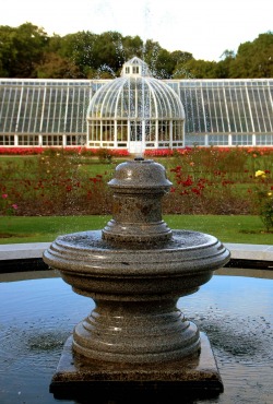
Here is the jpg version of the image, which was straightened and cropped. As the various eye droppers have been used the colours emerge clearer compared to the unprocessed image.
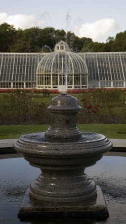
The raw version. I used the white balance eye dropper in the raw window here, which basically customises the white balance. Through the raw converter it was easy to avoide the highlight clippings in the sky, but the image generally looks duller than the jpg version. I find it difficult to say which looks the best, but above all I want to keep the image looking natural. Comparing the two images of the fountain, the second one probably looks more natural.
My conclusion from this exercise is that it is easier (for me) to keep a natural looking image in the raw format.
I am very conscious not to over-process images, something I'm sure is very easy to do as a beginner to Photoshop. I find it difficult to decide what is accurate. It's quite an arbitraty decision and a matter of intepretation. Michael Freeman also discusses this in his article Over-processing. I think his point is that everyone has to decide for themselves what they want to get out of the processing. If we have a reason for over-processing, e.g. if we want to express a specific interpretation, it's legitimate to go ahead. But we must ask ourselves why we increase or decrease a certain slider, for what purpose, and not do it only out of habit, to try to improve an image without thought.
Exercise 14: Interpretative processing

This is an artist's interpretation of the building using a charcoal technique. Well not really, it's my interpretation of such an interpretation, using a Threshold adjustment filter in Photoshop. All midtones were thereby deleted. I think it looks quite interesting, even though not exactly like a drawing.

Here is an old colour photo my father took in the 1960's of the same building. It has the characteristic tint which old photos you might find in a drawer might have. I'm quite pleased with this interpretation which was created by a yellow filter in Photoshop, and increased saturation.

This sun bleached imaged has been posted in the window of a tourist office for years. It has the same pale blue tones as a portrait in a hair dresser's window. It was created by adding a cooling filter and increasing lightness.
I enjoyed playing with different adjustments control, as there is no right or wrong, only imagination.
I enjoyed playing with different adjustments control, as there is no right or wrong, only imagination.
Exercise 15: Black and white

The sea was dark blue and the sky clear blue too. I still chose this colourful scene to be converted to black and white to emphasise the graphic qualities of the straight horizon and the diagonal of the stone wall. The texture of the stones and the clouds are also enhanced by the conversion. I used the conversion option called vivid landscape as the lighter stone wall stands out more against the darker sea.
Exercise 16: Strength of interpretation

A strong increase in contrast has made the the colours darker and the image does not gain a lot from this treatment.

The black and white version has received the same amount of increase in contrast and the vegetation stands out as a silhouhette. Quite a pleasing image.

Both images of the clouds have received the same low key treatment by shifting the brightness in the Levels adjustment layer.

The colour version looks dull whereas the black and white version looks more dramatic even though the same amounts have been used.
I conclude that a black and white image can receive stronger tonal changes compared to a colour version.
I conclude that a black and white image can receive stronger tonal changes compared to a colour version.
Exercise 17: Colours into tones - 1

This is the original image in colour.

A default black and white image. The colour is simply removed resulting in a no adjustment greyscale image.

The red channel slider is increased, green decreased. This results in the red apple appearing white.

Increasing green, decreasing red makes the red apple darker.
Exercise 18: Colours into tones - 2

This image is manipulated to achieve the effect of green vegetation which appears light in tone. When converting to black and white, I increased the green colour slider to make the green paler and then in an levels adjustment layer, black input slider towards the right to make sure the shadows became black.

This is a default black and white conversion by desaturating. It looks rather bland and uninteresting.
Assignment 3 - Monochrome
The purpose of this assignment is to produce a set of images and bring out the monochrome qualities of form, tonal contrast and texture. It is also important to show different creative effects.
All details about this assignment are in my report to my tutor.
The purpose of this assignment is to produce a set of images and bring out the monochrome qualities of form, tonal contrast and texture. It is also important to show different creative effects.
All details about this assignment are in my report to my tutor.
