2. Landscape - Light and its measurement
Project 12: Contrast and exposure
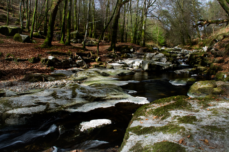
In the images below I used spotmetering, manual exposure and kept the same aperture (f8) through out. The image with automatic exposure obviously have different settings.
I measured the darkest area in the shade as 1/25, and the brightest building in the middle as 1/500, keeping the same aperture. The average of the two shutterspeeds should therefore be 1/125, and the image below was taken with that speed.
To answer the question how to get a less contrasty image I started to think about combining different exposures in postprocessing and techiniques like HDR, not really thinking about the obivious ideas like recomposing.

Manual exposure: ISO 200, 1/125, f8
Highlights are blow on the white building.
Highlights are blow on the white building.

Automatic exposure: ISO 200, 1/200, f7.1.
The automatic exposure is pretty close to the average metering as above.
The automatic exposure is pretty close to the average metering as above.

Manual exposure: ISO 200, 1/125, f8
Converted to black and white.
I'm looking hard (in my image browser) to see if there is any difference in details in the colour and black and white image, which I took digitally. The material talks about negatives and transparencies, but I'm not sure how this would correspond to digital images.
Converted to black and white.
I'm looking hard (in my image browser) to see if there is any difference in details in the colour and black and white image, which I took digitally. The material talks about negatives and transparencies, but I'm not sure how this would correspond to digital images.

Manual exposure: ISO 200, 1/400, f8.
Spotmetered on the white building in the middle which gives an image with no blown highlights.
Conclusion: manual exposure, and spotmetering on a specific point, gives the best result, instead of letting the camera do the "thinking".
Spotmetered on the white building in the middle which gives an image with no blown highlights.
Conclusion: manual exposure, and spotmetering on a specific point, gives the best result, instead of letting the camera do the "thinking".
Projct 13: Throughout the day
For this project I was lucky to spend a sunny day in our summer house, when I was able to go to the same spot throughout a day. Otherwise I would have found it difficult to follow through with this project. I remember doing a similar project for TAOP, so I had an idea of how the light would change, but it's interesting to do this with a landscape with relief, as the change is prominent.
The first image was taken at 07 in the morning, the last at 22 in the evening. It's evident how the light moves. It moves the fastest in the morning and in the eveing. In the first images the sun shines on the right to the left. It then moves to shine on the trees to the right. It creates a very high dynamic range and it's difficult to expose for both sides. In some circumstances I have rescued some clipped highlights in postprocessing.
I prefer the first image in the series, taken at 07 in the morning, because it has the most unusual light compared to what I'm used to. I'm not used to seing the light coming from that direction.


Some inspiration below.
Project 14: Changing light/changing views

Morning
The sun is rising behind the cliffs. The sky is coloured pink and blue, and the cliffs appear as a silhouette.
The sun is rising behind the cliffs. The sky is coloured pink and blue, and the cliffs appear as a silhouette.

Midmorning
As the day gets brighter the sunhaze gives the cliff different shades of grey. Therefore I closed up on the cliffs as they were the most visually interesting. The sky and the water was pretty much the same tonal range, and did not add a lot of interest.
As the day gets brighter the sunhaze gives the cliff different shades of grey. Therefore I closed up on the cliffs as they were the most visually interesting. The sky and the water was pretty much the same tonal range, and did not add a lot of interest.

|
Midday The harsh and flat midday light does not flatter the sky and cliffs. Because of this I concentrated on the stones in the water as a foreground, which I thought looked beautiful. |

Midafternoon
The light is still quite harsh in the midafternoon. I included more of the area around the location, as it would add more interest.
The light is still quite harsh in the midafternoon. I included more of the area around the location, as it would add more interest.

Evening
In the warm evening light, the cliffs looked golden. I concentrated on the colour and structure of the cliffs as a close up, as I thought they looked interesting. I think it's not necessary to include sky and water in every image, but a close up can look interesting too.
In the warm evening light, the cliffs looked golden. I concentrated on the colour and structure of the cliffs as a close up, as I thought they looked interesting. I think it's not necessary to include sky and water in every image, but a close up can look interesting too.

Close to sunset
As the sun is setting the view becomes quite similar to the morning shot, but as the sun is from a different direction, we can still make out a building at the bottom of the cliffs. I think the sky is the most interesting factor here, so I made sure the sky took up the majority of the frame and also to include the moon at the top right corner.
As the sun is setting the view becomes quite similar to the morning shot, but as the sun is from a different direction, we can still make out a building at the bottom of the cliffs. I think the sky is the most interesting factor here, so I made sure the sky took up the majority of the frame and also to include the moon at the top right corner.
Project 15: Planning your portfolio
The location I have chosen for this project is Lough Tay in County Wicklow. The images were taken from a height above, looking down on the lake.

Autumn

Winter

Spring

Summer
Take 2

Autumn

Winter
Spring

Summer
Assignment 2: One acre
| assignment_2.pdf |


In my tutor's response, she thought my assignment was both individual and personal. She had interpreted some images as the spirit to be threatened by the surroundings. I had not thought that the images could be perceived like that. I imagined that the spirit was one with the forest, almost being the same entity as the forest, and therefore couldn't be harmed by it. But it's interesting how interpretation can differ.
My tutor liked the images best where the figure took a bigger space in the image as it would create a better balance. I personally like that the figure is not obvious when first looking. It could be so small that you only notice it when looking closer. It's not easy to perceive the spirit of the forest and that is what the small figure represents.
She particularly liked picture number 4 - Grass, because of its colouring, blurring and depth of field. That image is not my favourite so I'm a litte suprised.
On the other hand she suggested I should rework those images with blown highlights. I'm guessing that would be image 5 and 8. Also maybe retake some of the images to create a better balance between the figure and the landscape. I'll be back on this acre in August, so I might be able to do so then.
I have reworked the assignment below, by adding images with the figure bigger and more visible. I have also toned down the white sky in postprocesseing.


The final completed assigment therefore looks like this.


